Thursday 21 May 2015

Ed: Post Mortem


In this document I will be discussing my final major project, the problems and successes that we faced and whether or not I feel we achieved what we set out to do. I would also like to discuss the ways in which I will use this project in the future.


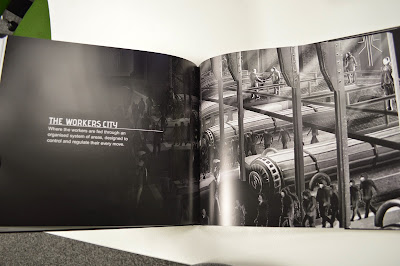
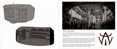
For my final major project I worked together with Lucy Freeman to produce a concept art book based around the nineteen twenty-seven film Metropolis from Fritz Lang. We aimed to produce a seventy five page book that displayed a range of subjects as we redesigned the films characters and settings. We also hoped to display our process and how we thought through our designs, with a focus to its eventual use in a video game context.


Our research had us looking at historical mining works and modern cities and constructions; we wanted to show the clear divide between the two halves of the population.

The duration of this project was eighteen weeks once we had received an extension at the beginning of the Easter Holidays.


The primary structure of our project was one of 'mini' projects; we would pick a subject and work on it for either a week or two weeks in length each time. In this way we would complete a chapter for the book with each project. My aim was to complete a chapter after each two week time slot giving me time around this to produce other content for the book such as covers and prologues and also to format it for printing, as well as provide us with two weeks at the end before hand in which would allow us to send off the book for printing and have it arrive in good time.


Though this structure didn't exactly go as planned, as certain projects took less time or more, however with a little time management it was easy to juggle the times around and we were also provided with a three week extension before the Easter holidays which not only allowed us some breathing space but also allowed me to work on some of my stretch goals that would not have been completed otherwise.


We were very successful, Not only did we meet our target of seventy five pages, we exceeded it by a wide margin. We had actually produced nearly one hundred pages of work each by the time we began to edit the book down into the finished one hundred and thirty six pages you will see when we hand it in.


My personal successes I think are the techniques I used to produce so much of the work here. I married familiar design techniques with newer ones and I used skills like white boxing and paint over to a scale that I had never used before. Often the speed at which I was able to produce my designs was greater than I expected.


I am particularly proud of our consistency in style, colour and motif. We put a lot of effort into not only establishing a recognisable and consistent visual style to the city and its people but also enriching it with meanings, reasoning and the feelings of the people who would have created this culture. It was an interesting experience to think not just about my own process, but of the process of the fictional people who would have constructed the society and buildings that I was designing.

Another success was being able to fill one of my personal stretch goals; as a proof of concept and as a piece to show at the degree show I was able to sew a set of clothing for display. I chose to replicate the three main garments from Freder's outfit.


We were in fact very fortunate that we didn't have many setbacks. The printing process of the final book went very smoothly and we were able to work steadily and efficiently throughout the project. Where we did see setbacks they were often beyond our control or easily managed.

Our first major setback was in the printing of the first, tester book. We sent off to different companies to get to examples of what we could get printed however we had some trouble with transferring money to one of the companies. This was a setback that took nearly a week to fix with several calls to banks, and problems with banking servers. In the end we did not use this company; though once the money had been sent through we received the book quickly the print copy was lower quality than the company we would eventually use, with many printing errors.


We had minor issues with software as we came to format our pages. We started out using Microsoft publisher, believing that it was a powerful enough program to handle the needs we had when it came to showcasing a large amount of text and high resolution images. It quickly became clear however that our work was overtaxing the software which would often fail to display the images often in the software itself but also when the document which was visibly fine was exported as a PDF file where the images would be displayed as a large red 'x' or not at all. We solved this problem by switching software. Originally we had not wanted to use Blurb's downloadable book creating software because of some of it's odd image positioning qualities and the limitations on installing software on the university computers. However this is the software that we would eventually use and once we had gotten used to the different processes involved compared to publisher's software we were able to produce the book at the same speed we had hoped to achieve with publisher, whilst eliminating the problem with images. Blurb's bookwright program was more than capable of hosting the large, high definition images we had produced.


Our main issues were found in visualizing scale when it came to deciding what to concept. Often our settings were just part of vast areas and it was easy to get a little lost and legged up in concepting everything and often would find that there was a subtle sense of wrongness in the scale of our images. We found that a great way to help ourselves get over this was to draw the whole area, rather than trying to visualise a medium area with small concepts in it; by establishing a rough overarching scene with quick sketches we could give ourselves a sense of scale that seemed more correct when it came to designing medium or small areas within the whole.


Moving on into the degree show preparation work we are hoping to create different ways for the artwork to be viewed. We're also looking to get some large prints of the artwork displayed during the degree show.


We didn't have many project changes. We rearranged the books layout slightly and changed the areas that we intended to work on but other than that we stuck closely to our final brief.


Looking back on this project The things I would do differently are mainly to do with how the book was produced. At the beginning of the project we made templates to add our images into. We didn't stick to these though as we were creating our images and we found that it produced a little extra work at the end of the project. The first thing I would do differently is adhere to these templates more closely. I would also start putting the work into them sooner. It got quickly tiring to do it all at once and I believe that working on it steadily throughout the project as we'd originally intended would expedite the process and prevent the tedium we felt as we did it in one large chunk.

Personally there are elements I would have liked to push further, I realised too late into the project that the female characters heavily outnumbered the men and it was too late to change it, doing this project again I would have liked to have a better and more even range of genders in the characters.


In conclusion I believe that this project has been a huge success we have excelled in what we wanted to achieve and we have exceeded our goals and even our expectations to produce a body of work that we can only be immensely proud of. We've produced a professional looking piece of work that has translated exceptionally into the format that we wished to show it in and we've managed to supplement our work with other varied mediums to demonstrate a wide range of skills, disciplines and interests.


Looking to the future I intend to use this project online and in person as a portfolio of my work and design process and I also intend to build on it for other portfolio pieces, branching out in my own time to display 3D modelling skills and engine skills as I create the environments and characters.

Lucy Post-mortem

This project, has been nothing more than a success in my eyes. I’ve never felt such pride for any piece of work before. From pre-planning to production and the overall execution of this book, everything flowed well. There were very few issues with designing, and none of these hindered the completion of this book, nor predisposed the final quality either.


If I were to stick to my original idea of doing this by myself with an original story, I feel things would've turned out a lot differently. I think amount of work I’d set myself would take its toll, and would have had to cut down the scope of my project. I would still work just as hard on quality, but I think my designs would suffer greatly. Due to not having someone to ask for their opinion or to collaborate on my work with. If I were to go to others, I feel I would've become very precious with my work, as it would be solely me working on the project. Therefor I wouldn't be open to change and my design could have turned out flat with very little iteration.

My best decision for this project was to team up, and it truly did pay off. I felt that both me and Ed worked well together. We were able to decide on, and stick to a pipeline and working structure, to get the work done on time and to a high standard. I feel the strongest element of our final book, is how unified it appears, despite have two people, with two different styles working on it together. We naturally chose to design the two sides of the society of the world of Metropolis. Yet we still managed to make both sides appear to co-exist in this world together. I feel we achieved this through constant communication and collaboration. I would always ask her opinion on my designs, and I feel they turned out better because of this. I feel the final book really does show that iteration, with the text really understanding, in depth, what our thoughts were at that time, and why we went with the decisions we did.

My biggest struggle with this project, was the workers city environment I had to design. As this subject covered a huge area of the world of Metropolis, I really found it hard to pin point the area to design and also exactly what they were going to be. I spent 4 – 5 weeks on this environment, and this way over shot our goal. We set up a time scheduled and it worked out as one mini project a week, so a character designed in one week, and environment designed in another week. To get over this design block, I asked Ed for her opinion and she drew up a simple diagram that easily explained how she saw the infrastructure. This cleared things up in my head and really narrowed down the areas to design. I still took longer then planned after this, but the final result turned out a lot better than I expected. I went from hating the final image, to seeing it printed in the book and it being one of my favourite pieces of work I did for the whole project.


My weaknesses were definitely designing environments. I feel with each one I improved and I applied new techniques, such as white boxing and this really did help, However, I feel I still need to practice this technique, as well as normal PhotoShop painting. I felt there were times when I relied on photo-bashing too much, and I feel this hindered the look of my work slightly. I think if I were to do it again, I would've relied less on photos and really trusted my own painting techniques more. I feel using the photo-bash technique did make me lazier when it came to the final concept art painting. Because of my reliance on this technique, I felt a little out of practice when it came to digital painting. I think for future projects, I’ll try to keep the use of photo-bashing to a minimum and try to use my painting skills more. I feel doing this will give my work more authenticity and there'll be more fluidity to my final images.


Another element of the project that went well, was keeping to the pre-determined time scheduled. After printing the tester book from both Blurb and ePubli, we decided Blurb were the more reliable option, and they also produced a better quality book. The blurb book arrived in one week after putting the order in. So we decided for our actual book, we would put the order in two and a half weeks before the deadline. As it would be bigger with a lot more pages, we felt this would ensure we'd definitely have the book ready for hand-in. We managed to get the book sent off for the exact date we planned, and this really proved to myself that I can time manage very efficiently.


The book turned out great and the print quality was very nice and rich in colour. The only negatives were that a couple of my black and white design work, printed out a little too dark. We mentioned possibly printing off another book for degree show to correct these errors, as well as a couple of typing and spelling errors. However, for now our main focus for degree show, is the art gallery level idea, to showcase our work interactively. If we were to reprint the book however, I would like to readdress the layout. As we nearly doubled our initial page count, we didn't take time to number the pages and add a contents page. I think that could have been a chance to showcase our graphic design skills a little more. Plus make the book a little easier to navigate through, however I feel the lack of a contents page doesn't jeopardise the quality of our final book.


For portfolio, I feel the book looks highly professional, and for interview purposes, it would be a great asset to bring along with me to show my work. However, it did leave me with very little diversity within my portfolio. As it is just characters and environments, there isn't much variety in the work. We thought of adding vehicles for stretch goals, and this would add diversity. Also, we never got round to modelling small example assets as we thought we could do for stretch goals. I feel the work I produced for this project is of a high quality standard, but just lacks in diversity for portfolio purposes. A lot of developers are looking for generalists, so in that aspect, this project has left me a little short. However, this work has been the best quality I have produced during my whole 3 years on this course. I can honestly say I’m proud of what I have achieved. We exceeded our initial page target and still managed to not drop the quality. We managed to still convey our ideas well, and were able to describe our thought process’ within the text of the book.


Ultimately, I see this project as a success. I set out on this task with a very specific idea, and yet it turned into something that I never could foresee. If anything, it has been a huge confidence boost for me. I’m believing in my ability as an artist a lot mare, and I only want to continue to improve. This project has taught me so much about myself and how I work, not just by myself but as a team on a collaborative effort. The lessons I have learnt from this will be important reference to future projects. I plan to set myself several projects to increase the diversity in my portfolio, in the hopes it will make me appear more employable to developers. I want to increase my range of skills and I feel this project has given me the tools and self belief to try and diversify my skill-set. This includes 3D modelling and engine work. To have a physical book of high quality, that I can hold in my hands filled with all my work, is such an amazing sense of achievement. I hope for degree show, the people from industry will see and appreciate all the hard effort, both me and Ed have put into this book. I hope they can see potential for their companies and help us get that oh so important foot in the door. I also hope the final grade I get overall, reflects my efforts throughout my time at De Montfort University, and set me up onto a successful career path. 

Wednesday 20 May 2015

Lucy Week - 16: Final Hand in Week

I used this final week before hand in, to do some basic house keeping. Also to start thinking about degree show. Ed took the time to write up an asset list for our art museum idea, to showcase our work at degree show. Once hand in is done by the end of the week, I can really start to get the ball rolling on that.
The modelling of assets won’t be the hardest part. If anything a lot of the assets we need to make are mainly boxes and very simplistic. It will mainly be about the textures and even then, they will still be very minimalist to reflect the simplistic decor of most modern art galleries.
The bulk of the work will be in engine, and I see that as a great opportunity to get more practice with it. Employers are always looking for generalist, more and more as the demand for games grows greater. If I can add this to my portfolio, I think it will really help with showing my diversity when it come to how I work. Making me appear a good member of any team.

I’m really looking forward to handing in this project. I’m so proud of what both Ed and I have accomplished, and I really hope all the hard work we have put in over the months, will pay off.

Tuesday 19 May 2015

Lucy Week – 15: RECEIVED THE BOOK

Exactly a week after we sent off the book, it arrived and we were both so thrilled with the results. The print quality is beautiful. The only slight negative was that some of the images were a little too dark but ultimately the book is fine for hand in. The tutors have seen the book and also seem very excited by it. The book came a week early, which really relieved any stress that we may ave had.

Later this week we had a meeting for Degree show. This was where Ed came up with a fantastic idea to make a simple level for degree show, which would add some interactivity to our display. We wanted to create an art gallery style level with very minimalist decor and furniture, which features the work from our book. Also, if we can, have the text from the book that corresponds to that image, appear on the screen for people to read. As we finished early, we felt we’d have the time to make this simple 3D level. 

Lucy Week – 14: Finalising Book Layouts and Sending Book

This week we planned to have the book ready to send off of either Wednesday or Thursday. I started with organising my images into pages and save them out as jpegs. These would then be ready to go into the Blurb program where text can then be added. Below is an example of one of the double page spreads (DPS)


This took a couple of days to organise and I then went on to design chapter pages which were gonna be a splash page. These are the finals for both the character and environment chapter pages.


 Once we had our individual pages sorted it was tiime to write a preface each as well as a joint foreword alongside a foreword from our tutor Mike Kelly. We came up woith a simplictic designs that still followed the themes of the books artwork.

We then were ready for the send off and on Thusday the 7th of May we sent our book. It was due to arrive on or before the 19th of May, so this gave us a good space of time to make sure we hae the book ready for hand in. 

Lucy Week - 13: Improvements Based on Feedback

27/04/2015: Day 1 -  Workers City Final
I spent the whole day making the suggested improvements on the workers city. I started with adjusting the colours. Mainly breaking up huge spaces of colour with other, complimenting colours. Once I was finally happy with the colours, I then worked on the lighting. I worked on intensifying the spot-lights by adding light beams and making certain lights a very vivid cobalt blue. I worked in some more detail on the wardens in the foreground.
Finally I added more focus on the door at the end of the corridor. As all elements of the scene draw the eye to this point of the image because of its perspective I felt the vanishing point which becomes the point of interest should have more detail, so I adjusted the screen and brightened the corridor beyond the door.
This piece has been a struggle from the start, so I was so pleased to finally be happy with the end result.

28/04/2015: Day 2 – Maria improvements/Propaganda
I quickly designed a broach for Maria and added it to the final. I also worked on the seams of her clothing. This did add that bit more realism that I wanted the final images to be.

Next I wanted to improve the Catacombs final. To start I though I should design some more propaganda. I started with trying to think of slogans and memorable quotes that would go well with striking imagery. Below are the final results.

29/04/2015: Day 3 – Catacombs
Now that I had some propaganda to work with, I started to dress that catacombs scene with these images. After gathering some opinions, I worked on filling in some blank spaces, to improve the composition of the piece. I added some more lights to further add to the composition but to create even more of an atmosphere as this whole area has no natural light. I think this added lighting really helped make that fact more obvious and really emphasized the purpose of this area.


30/04/2015: Day 4 – Lab Colours
I went back to the Laboratory final as I felt the colour were looking a little washed out. I decided to break up the image with key colours for the specific areas. As his study area is lit by natural light, I thought is makes scene to make the colours of this area warmer. This then helped when adjusting the colours for the rest of the scene.


01/05/2015: Day 5 –  Thin Man and The Inventor
I spent today working on the Thin and Inventor improvements. I started by brightening up the Monocle. It was already a very vivid acid green. However as it was semi transparent, it appeared a lot darker in the final image so I decided to give it a slight glow. I think this added a nice touch to the final image.

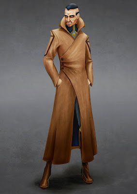
For thew thin man I added the seams to the coat and also the gold trim around the foot of his boots. The gold trim really helped in breaking up the silhouette of the boots. 

Ed Week 16: The Final Week

This final week I've been working on stuff for the degree show, as we're pushing to hit some of our stretch goals.

This weekend I brought down my mannequin to display the costume on. Though we've been disguising how to display the book at the show it looks like there simply won't be time to make a custom podium for it.

Now that we've got time to work with what we're planning to start this week and continue into the degree show prep time is a small working level for the art to be displayed it. Just a little bit of fun for the visitors of the degree show.

We'd like to produce a small art gallery space that displays some of the art we produced for the book on it's walls. This way we can give people a different way to view the artwork especially as the book may not be displayed at the degree show on days when it cannot be watched over.

This level is a quick way to get some interactivity into our project and also provide visitors with a 'video game' experience of the book we've produced.

At the start of this week I produced an asset list and started to create some of the assets for this art gallery.